Metric Weather
Metric Weather is a responsive web application designed to help water sports enthusiasts maximize their time on the water.
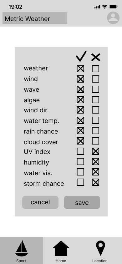
This case study was created as part of the CareerFoundry UX Immersion certificate. The aim of the app is to provide the exact forecast that every user needs. Users have the ability to edit the metrics that appear in their forecast so that they can see the information they want, and none that they don’t.
Date
05/2023
Roles
UX Researcher
UI/UX Designer
Interactive Prototype
This is the latest iteration of my prototype. Keep reading to see how I made the decisions that led here.
Problem Statement
The Problem:
Existing water sport forecast apps specialize in one sport (overwhelming beginners with information) or provide general forecasts (which lack info experts need).
Both of these can lead to dangerous mistakes that affect safety.
The Solution:
Water sport enthusiasts need a way to accurately gauge water and weather stats based on their personal skill level.
We will know this to be true when less than 5% of users who use this app report that the weather differs from our forecast.
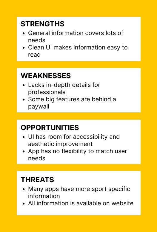
Competitive Analysis
General Marine Weather App
This app’s goal is to provide accurate wave, wind, and weather forecasts along with easy to read charts. They emphasize “professionally designed UI/UX” and user friendly design.
Sport Specific Weather App
This app’s goal is to make it easy for surfers to find out what the conditions are at locations near them so they can decide where and when to surf.
User Research Findings
I interviewed three water sports enthusiasts to understand their behaviors, needs, and pain points. After creating an affinity map and conducting analysis here are my findings.
In my affinity map below, behaviors are listed in pink, needs in blue, and pain points in green.
-
Weather metrics needed varies by sport and experience level
Most interviewees use more than one app/website to get data
Interviewees trust what they can see and know their own limits. Experience level changes needs
Interviewees want to maximize their time on the water and get the most out of that time
-
Some users trust their own eyes over any app or advisory
Some users go to locations all over the world for their sport
Some users like to plan trips just to do a sport
-
Some users trust advisories and apps over their own judgement
Some users can only do their sport from one main location
Some users can only do their sport sporadically
User Personas & Mental Models
Initial Site Map
Before making any wireframes I made a site map to determine the screens I would need.
I then conducted a card sort to ensure my site map grouped categories in a way that would make sense to the users, not just myself.
Card Sort Testing Results
Looking at the card sort data showed that while water sport locations are always grouped together, and specific water sports are always grouped together, the metrics of weather are further divided. The weather metrics are split into water related weather (water temp, wave height, etc.), air related weather (air temp, cloud cover, etc.), and wind weather (wind speed and direction).
Since my initial hypothesis was that every different water sport athlete needs different weather statistics, it makes sense that the weather metrics were grouped together and not with any location or sport.
My initial sitemap had four second level pages for sailing, diving, surfing, and location. But based on the way the card sort revealed that locations and sports are so inherently connected, I decided to move all of the individual sport pages under one main sport page and create sub-pages under locations.
Revised Site Map
This new site map has a critical first step in determining the type of information a user would be looking for: either sport specific info, or location specific info. From there, the user will have more targeted information that they can then edit to craft the perfect weather report they are looking for.
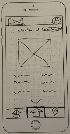
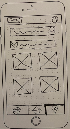
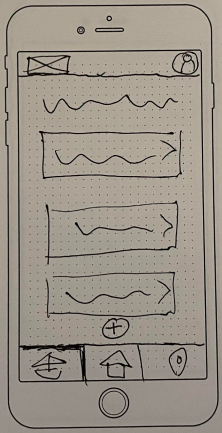
Wireframes
First Prototype
Usability Testing
Using my Figma prototype I conducted usability testing with six individuals.
From my usability test I was able to identify a number of errors and observations that helped me see what was lacking in my first iteration. The largest error was that I had completely omitted a screen in the desktop version that was available in the mobile app.
The test also showed me what features users felt were essential to the app. I had planned for some features to be added later on, but after t his round of testing I realized users expected them immediately.
Latest Iteration
